Choosing greens – a curse or a joy
Choosing greens: for some artists, dealing with the ‘nasty greens’ is a nightmare – and I’m not talking about vegetables. But using green paint in your art doesn’t need to be a nightmare of indecision. With good judgment, it is possible to use green paint successfully.
Given that our planet is clothed in green, if you’re a landscape artist, avoiding the use of green seems impractical. Perhaps because of this profusion of green in our earthly habitat, the human eye can distinguish more shades of green than any other colour. The best guess is that this is an evolutionary adaptation linked to survival. After all, choosing the right plants to eat is an important skill. But equally, this may well be the reason so many artists find green uncomfortable to us. Get the shade slightly wrong and the whole image feels just off-target enough to be visually uncomfortable to some. The flip side of that is that, when used well, green can evoke a feeling of calm in an artwork.
One of the biggest challenges with green paint has traditionally been the unnatural hue of old-style greens. Viridian, sap green, hookers green – try holding any of them up against real foliage and see how they harmonise. When I started painting, I squeezed those three colours into my palette. Ten years on, I’ve yet to use them up.
Tips on choosing the right greens
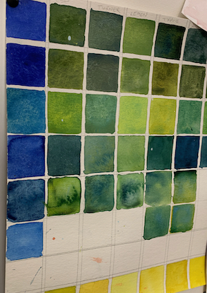
To get to know your greens, make a grid of your blues and yellows and see what each combination does. If you have 4 or more of each colour, you will be amazed at the variety of greens you get.
By just making tiny adjustments to the ratio of blue or yellow in the particular combination you choose, you can vary the tonal value and the hue harmoniously
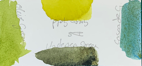
These days, innovations in the range of paints available mean that there are some far more exciting greens straight out of the tube. When you select granulating greens, they can also deliver the types of variations you see in a landscape.


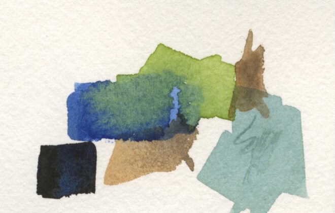
I now use colour swatches I have created in watercolour and acrylic paintings. Hold the swatches against the other colours in your painting and you’ll soon see which greens harmonise, and which create an exciting pop of contrast.
This way you can develop your personal collection of greens. Gone are the nasty greens and in with the gorgeous greens to use in your paintings.
(If you’re interested in colour, here’s a post about beautiful blues).

