
Not all Granulating Watercolours are Created Equal
Granulating watercolours have become increasingly popular, so watercolour manufacturers have responded to this trend by adding innovative paints to their collections. The range of effects that can be achieved simply by choosing the right tube of paint is staggering because every pigment is slightly different. Each one delivers a different degree of texturing as well as shifts in shade and tone.
There is a skill to creating a perfectly smooth wash of pigment on a sheet of paper. However, it also pays to have the ability to master granulating watercolours too.
I have always been a fan of texture in art, and granulation is one of my favourite effects. Granulation can be overused, so careful consideration should be given to when and where to use it to enhance your artwork. Then there’s also the choice of just the right colour and tone.
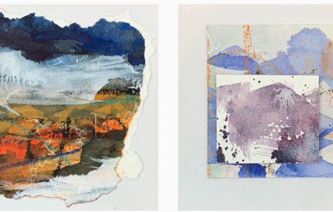
The ability to use granulating watercolours judiciously is a valuable element of the artist’s repertoire. As a landscape artist, I use granulation to indicate the variations in the land and elements of nature. Consider rocks and sand, tree bark, and dense forest undergrowth, all of which has unique texture.
About granulation in watercolour paint
Granulation occurs when heavier particles of paint drop to the paper faster than the rest of the solution, creating an uneven appearance. Some pigments are harder to mill and tend to create larger particles. Granulating watercolours are more common in the earth colours, blues, purples, and green, but fewer red and yellow pigments are granulating colours.
The two other factors that have a significant effect on granulating watercolours are water and paper.
Adding more water to the paint will increase the granulation effect. This technique works best after the paint has been applied to the paper and the particles have started to settle,
The texture of the paper has a major impact on the visual impact on granulating watercolours. HP paper decreased the granulating effects. Generally, the rougher the paper, the more granulated the colour appears.
Daniel Smith Watercolours have an incredibly wide range of colours – many of which have wonderful granulating effects. You can download their full colour reference brochure here.
It pays to get to know your granulations because every choice you make in a painting adds or detracts from the final result. Here are some exercises I suggest you try.
Comparing non-granulating and granulating watercolours
I used a few of the Daniel Smith watercolours and St Cuthberts Mill papers to demonstrate some of the differences you can get.
First, pick a few versions of a colour – some granulating watercolours and some with no granulating properties.
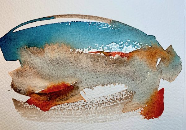
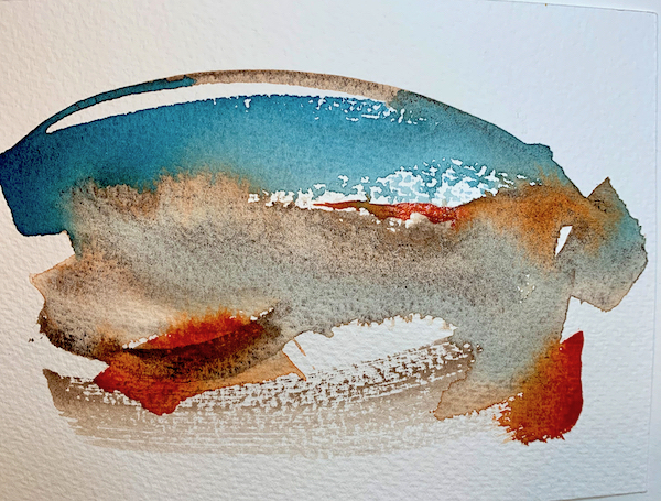
I used Indanthrone Blue (non-granulating) and Cobalt Blue (granulating) on Bockingford 300gsm (NOT) paper. The object of this exercise is to compare the pigments as directly as possible. Use the same paper for the excercises in each colour.
- Paint an area of clear water and then drop in a medium concentration of paint. Leave to dry.
- Paint a saturated section directly onto dry paper and leave to dry
- Paint an area with the same saturation as in the second swatch. Allow the pigment to settle for a few minutes. When the paint still has a sheen, add a drop of clean water to the centre of the swatch .
- Paint a final swatch and allow to get to the stage of dryness where the paint no longer shines but has a slight sheen. Using a fine atomiser, spray a light mist over the paper from about 20cm above the paper. If you hold the spray too close to the paper, the paint will be dispersed too much by a concentration of water in one place.

Cobalt (Granulating) Indanthrone (Non-granulating)
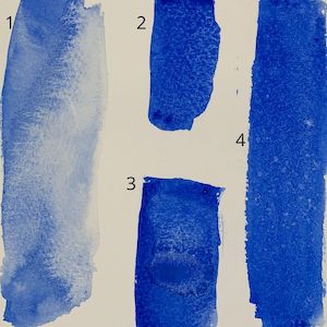
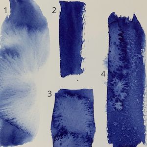
As you can see from the photographs there are distinct differences in texture on each of these tests. The wet-in-wet cauliflower effect is smoother in the non-granulating colour. The granulation is clearly visible in the pure undisturbed swatch of Cobalt, and the swatch is smooth deep blue when the Indanthrone is used. The spray example shows more texture in the non-granulating sample, but I must confess to having had a minor spray bottle mishap so I discounted the large watermarks on the left side of the sample. However, the texturing is clear in the bottom third of the sample where there was no spray bottle problem.
Granulating watercolours merging swatch
This exercise was much more creative, although probably no less geeky. This aims to document the difference made by the texture of the paper. I used nine Daniel Smith granulating watercolours on three different papers:
The paints used from top left-to-right are:
- Quinacridone Sienna
- Moonglow
- Piemontite Genuine
- Bloodstone Genuine
- Hematite Burnt Scarlet Genuine
- Sodalite Genuine
- Quinacridone Burnt Orange
- Hematite Genuine
- Quinacridone Gold
Paint nine areas of clear water in a 3 x 3 grid almost touching. Add a brush load of different pigment into each of the nine areas. You can use whichever colours appeal to you, as long as they are all granulating watercolours. I decided to add a further drop of clear water to each blob of colour to increase the level of granulation, and also to let the colours blend slightly. Drawing a rigger through the grid of wet paint a few times to create connecting channels which allow the colours to start to merge a little. This step is entirely optional and was done because I was curious about the colour combinations.

HP Paper 
NOT Paper 
Rough Paper
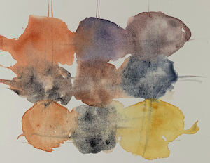
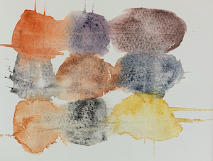

These are not empirical experiments because there are too many variables. The purpose was purely to observe the impact of different paper surfaces on the granulation appearance in the set of paints. Granulation is least visible on the Saunders Waterford 300gsm HP because it has the smoothest surface. The results on the Bockingford 300gsm (NOT) and Saunders Waterford 300gsm Rough were very similar. This is not surprising as both have sufficient surface texture to activate the granulation effect in the watercolours.
More granulating watercolour experiments
With over 100 granulating watercolours in just the Daniel Smith range, and many different paper textures available, the variations you can achieve in your paintings are way too numerous to document here. My suggestion is that you play with your paints. Use these two ideas for swatching some of your favourite watercolours (both granulating and non-granulating). Then get curious and start with the question, “I wonder what would happen if ….”
Build up your reference library of watercolour knowledge.
If you’d like to work with me, be the first to know when I open my next online course
![]()